We value your privacy
This website uses cookies to ensure you get the best experience on our website.
 Skip to main content
This website uses cookies to ensure you get the best experience on our website.


EyeQuant recently had the pleasure of contributing a guest post to the Smart Insights blog. Thanks to Dave Chaffey and to the Smart Insights team for chance to collaborate!
For this guest blog, we focussed on 3 helpful optimization strategies garnered from eye-tracking data.
Here’s what they are in a nut-shell:
Luminance Contrast refers to the brightness of an object in relation to its surroundings. We often think of the color red, for example, as attention-grabbing due to its emotional connotations of urgency and importance; however, red will only stand out if it has a high luminance contrast in relation to its surroundings.
The larger an object is, the more noticeable it typically becomes. A truck driving down a country road is far more visible than the woman riding her bicycle in front of it. All the same, making one element on a landing page too big will actually counteract the attention it might otherwise receive. It may seem like a good idea to put your company’s description in 300 point font, but the result will be akin to a background image – users will simply ignore it as decorative.
Why? An augmentation in the size of an object, whether it be text or image-based, means a decrease in the space around it, and space is a valuable commodity in landing page design. This is especially important to remember when placing a Call to Action button: This is your grand finale, and it needs some room to shine.
Just like in real-estate, a landing page contains high and low-value locations. On English-language web pages, for example, the upper left corner of the page is coveted because this is where most users are trained to start reading. The same is the case for the mid-right of the page, which is a location our eyes tend to pause at, and a natural place for a Call-to-Action to appear.
At the same time, areas such as the top right corner or bottom left corner of a page tend to be reserved for less important information, because they draw far less immediate attention. Oh yes, and anything below the fold should be thought of as all the way out of town – this is the last area of a landing page a user will explore in the first 3 seconds.


We look at how to leverage predictive eye tracking to improve your Black Friday marketing campaigns.
Read more
In this article, we’ll discuss our data-driven approach to CRO, including fundamental tools and principles that will help to...
Read more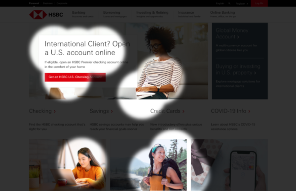
Great SEO brings users to your site. A great UX helps them achieve their goals after they arrive. Too...
Read more